Category Archives: Blog posts

the chunky Mona

An image I saw online was really funny and they used it to advertise to some spaghetti sauce.

The Mona Lisa by the Italian artist Leonardo da Vinci. this image is what Berger spoke about in his video about manipulating arts. as we can in the image above they used the technology to advertise spaghetti sauce. This is an ad for Prince’s Spaghetti Sauce.  One half shows Mona Lisa holding a jar of the sauce and underneath reads “Original.”  The other half is a heavier version of Mona holding the same jar of sauce, but underneath it reads “Chunky.” here in this image we see how the meaning of the original painting has changed by using technology so, it fit what Berger mentioned in using arts for another purpose so the original meaning has changed and a new meaning replace it. 

I think this add worked well for the spaghetti company even though I see it so funny. This add attracts the audience to see what they have done to ous famous Mona Lisa.

Blog Post #2

According to Berger in his video, “Ways Of Seeing”, since the invention of the camera, images could be manipulated to become a form of language.  This manipulation could take many forms some of which include rearranging the image itself, or by placing things before, along side, on top of, or after the images.  This new language could be seen as words in a dialogue used for many different purposes.  Some of these purposes may include selling something, promoting an idea or movement, or educating people.

This idea of an image or images being used as a form of language to sell something is demonstrated very effectively in the image below.  The image is an advertisement  for Fed Ex, who very brilliantly, use simple things to illustrate their product.  A map of the western hemisphere is painted on a wall that has two different people in two open windows passing a Fed Ex package from one to the other.  One window is located in what appears on the map to be China, or some other country in Asia, and the other window is located in northern Australia.  The advertisement implies that delivering a package to a different continent can be as fast, safe and secure as two people passing it from one window to the next.  The ad is extremely effective because it’s message is both very clear and simple, as well as being aesthetically pleasing.  In addition, the image is very eye catching and the message is exceptionally clever which adds to the strength of the advertisement.


The background of this picture is the painter of Eiffel Tower in Paris, France in 1953. The photographer is Marc Riboud. it depicts a worker who is painting a building. His movements are like dancers perching in the tower. The Eiffel Tower is also like his friend. Paris city is looming in the background of the photo.


The first time I saw this photo, it made me feel as beautiful as the scene from the movie. The beautiful lines formed by the tower and the rhythmic dancing poses of the painter showed a pleasant atmosphere. Happy hours from ordinary workers. Image is not only the form of information but also the different methods and processes we use. The perspective and details we pay attention to are the most important. Berger said in the video that we can’t find the details and positive reality through pictures. But Marc Riboud said, “I like to shoot very detailed things. Many details that others don’t pay attention to. I think that is very important.” important. God exists in the details.”

Ordinary people’s small things, ordinary life scenes, and then through vivid details to present the real world. This is the best way of artistic expression.

Blog Post 2


See the source image

The image is powerful  that everybody has different perceptions on dress color. The photograph is popular for its color perception. When viewers looked at the dress they perceived the dress pictured was colored black and royal blue ,or white and gold. The picture reveals the reality of human color perception. Berger “ Way of seeing” can be related in this picture because it tells a lot. The dress is one but it represents different colors to different people. The act of seeing something is not as objective as we might at first think. When we  see the art or pictures is conditioned by habit and convention because we tend to believe a large part of seeing depends upon habit and convention.we are conditioned to see the world in a different perspective. Our perspective centers everything on the eye of the beholders. Our habits and conventions go beyond just what the eye sees at the moment. The photograph emphasizes that even though people who appear identical can have different but equally correct points of view on the same topic.

To sum up, in this picture the perception about the color is different for different people. I have somehow seen both colors at different times. When looking at the photo of the dress , our brain is trying to figure out if it’s a blue and black dress in yellow light  or a white and gold dress with a blue shadow over it. 

Blog Post #2


The first image is the famous painting,The Last Supper ,which was created by Leonardo Da Vinci in late 15th century. The Last Supper is highly awarded because of its religion meaning and art value.This painting depicts the picture that Jesus had the last supper with his apostles in Jerusalem before his crucifixion.In addition , Da Vinci painted every characters’ facial expression in detail, he fully revealed  every apostle’s thought by depicting their behavior and facial expression. Therefore, most of the viewers can feel that why this joyful supper would disclose weird ambiance.

The second image is an advertisement created by  a gambling company. This image also depicts Jesus and his apostles ,but they are not eating supper ,they are gambling. Comparing to the authentic The Last Supper, this reproduction obviously changed its original meaning .It’s a very good example to prove what Berger says in the video that reproductions of painting becoming a “form of information” .In this case , the reproduction painting conveys a message that they are a gambling company with many betting items and everybody can have fun here in an interesting manner.I believe that many people even though they are not gambler would be attracted by this vivid advertisement.Therefore ,I think this advertisement really effective.

Blog #2

John Berger’s essay “Ways of Seeing”, tells us the way we see a painting and how it can lose its artistic value and the ways it can become distorted to the people who see the artwork in different light and not in its original artist work. There are many types of artwork that have been distorted and lost its value from the original meaning. For example, the traditional Japanese paintings have meaning and usually given to the royal family of Japan. The differences of their artwork can mean different things. Like the following, Geisha painting has a deep entrenched in Japanese culture. It shows the beauty of Japanese women and also the meaning of the person in the art. Since real life Geisha does art shows. With that, the Yakuza gang use these Geisha tattoos to symbolize they are in a gang. With that being said, the community of Japan see this type of art on the body of people and they would assume that they are a part of the yakuza and bring trouble. They brought are fear to the people who see them with it because when they see it all they know is trouble might be coming their way and that idea is pictured in their mind every time they see it without knowing its Original art. That is why I believe this is an example of  losing value of its original art.

Blog #2


This comic image offers a powerful message about perspective and point of view. As we are working on Berger’s ways of seeing, I think this image justifies it in a significant way. In this image the two identical looking cartoons expresses different interpretations of a number based on where they view from. The image emphasizes that even though people who appear identical can have different but equally correct points of view on the same topic. But then one should expect the same from people with different perception. An individual’s behavior, opinion, mindset, assumption, has direct connection with culture, religion, economic or his life experience. Even though both cartoons possess different perception, both are right. Here, how you see things and where you’re coming from really matters. And the same goes for the other person.

It also emphasizes on putting yourself in the shoes of other people. It is important because it can help one to better understand and develop empathy which promotes generosity .Looking from others point of view may shed some light on what actually happened when both party are not wrong. It’s undeniable to say adopting character could help to see the other’s point of view. Though in real life, adaptation is much more complicated but the simplicity of this comic image highlights a hopeful message that different interpretation is possible.


Ways of seeing/Ways of hearing Blog #2

The example of  an image I encountered which attempt to convey a message regarding it is 3 wises Monkey . It was a paintings that displayed 3  same monkeys with different meaning .the first monkey has his hear closed  , the second one in the middle  has closed  his eyes and the third finally has his mouth closed too . This is kind of image that stand up with a message that people could interpret in different ways .first of all , standing in front of it  personally did not let me speechless or thoughtless. I had in my mind formulate a whole story of this image that convey me to change the way I was looking at the world . Questions  as why Shouldn’t I hear , see or talk matter ? What was the really meaning of the image ? Looking around  me , and analysing how some people got in trouble simply because they had said something that they shouldn’t have said  , heard what they shouldn’t hear or saw what they shouldn’t have seen I realise that the message, me the viewer ,who  was looking to  the image would have changed my thoughts .It does really convince me to try to stay away from nonsense-talk  , keep my eyes away from things that does mean to me and chosen well what I want to listen .After that I was really impress and inspired by the image I did the research on internet to figure out if the meaning that I gave to image was matching . I found it on internet in my phone which mean it was possible for me to see it on my screen .The same image with same meaning was on internet in different aspects of viewing . Some edited it in black and white , other in colour .I even saw somewhere that monkeys was clothed . The image come to us , we play with it do whatever we want with it .

That allowed me to take good decision by connecting those life still of living to stay away from trouble . It really effect they way I used to be .I was such a person who wanted to be in the epicentre of talking , hearing and seeing everything but I became more  focused  on things that really matter to me .But its it necessary to be convinced by  images ? Those images  or painting that we are seeing , is it not someone else ideas or  thoughts  , how will that relate to our own point of view ? This image requires alt text, but the alt text is currently blank. Either add alt text or mark the image as decorative.


Blog post #2

As an example of how duplication or photocopying can manipulate the original meaning, I could have chosen some commercial, maybe even some of the publications of mainstream media, which are manipulating the truth and reality by reproduction or just using a small part of the photographs/videos. Propaganda, conspiracies, fake news, manipulation by fear, but even the filtered pictures on social media. Artificial intelligence and personalized commercials processed by experts, and psychologists, convincing us to believe that our lives are not fulfilled until we get the specific product. Reportages on the same topic are usually divergent, and what matters is the side motivation of the presenter more than some codex of the profession. All that by also using well-know art pieces that can catch the attention of the buyer. But additionally, thanks to the invention of the camera, it is sometimes very difficult to find out where is the actual truth. That all is probably one of the biggest problems of reproduction and manipulation and the most dangerous features of the new century.
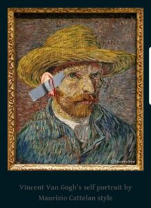
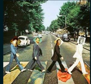
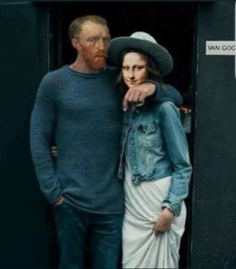
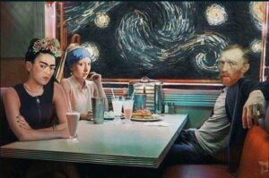
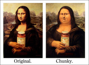
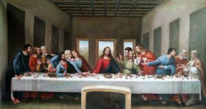
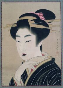
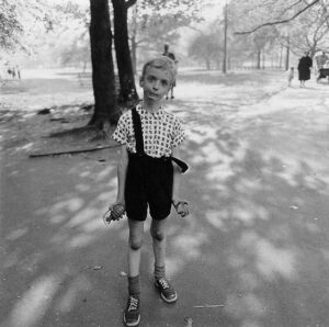
Therefore, I rather decided to use something more positive. At the websites of Judit Szeifert (https://szeifertjudit.com/), who is among other things, Hungarian art historian, I found the group of manipulated art pieces into memes in the context of humor, a manifestation of nowadays time, pop-culture, and contemporary art. (See the pictures below the text). These pictures are exemplarily presenting the importance of factors surrounding the art piece, and in some cases even changing the entire meaning by adding just one object to the perspective.
When I saw these pictures for the first time, my reaction was actually very positive. I laughed at them and had thought about them as funny replications, connecting the art, times, and humor. But not all of the viewers would, most likely, think about these memes as humorous and someone could even consider some of the concepts are barbarous, destroying our art heritage, degrading our society, or being offensive.
These memes are unmistakably manipulating the unique artworks. Brutally changing the circumstances, manipulating the perception of the viewers, changing the entire context, original meanings, and sending out different messages than was the primal purpose of the artists.
Despite all, I believe there is also positiveness about them as well. For instance, some of these “jokes” may require a need for a bit of knowledge to understand the meaning. We can also consider all collection as a progressive way how to approach the young generation and wake up in it the interest in art and general education more often than not.
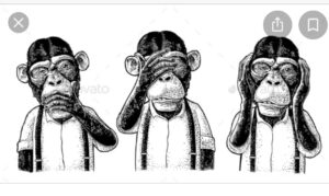
These memes are transmitting a satiric message which is positive. But as Berger said in the video, reproduction can be positive and also negative. In the end, we should be careful and always think about what is “behind the curtain”.


Blog Post # 2

The image inserted above is Child with toy hand grenade in central park by Diane Arbus (1962). I learned that at first glance you notice the child’s facial expression and how instead of posing as a playful and angelic boy he is captured in an intense and frustrating moment. The entire image creates this twisted innocence where you have this beautiful little boy who exemplifies rage and nerves. In his right hand he is holding a very realistic looking toy grenade, while his left is clenched into a claw. Nothing is medically wrong with the boy, but his momentary reaction to the event of being photographed has come to be more than a portrait. The child embodies awkward tensions between childhood games, not-so-childlike violence, and greater turmoil that defined the late 1960s and early 1970s, a time when there was a war. Arbus sought to expose the underbelly of society, which is often overlooked or ignored. What becomes apparent is the more insistent, larger narrative of American sensibility, lost in the  1960s.  I admire Diane so much for this photograph because she created a series based on this one boy of him smiling and playing in the park and out of an array of options she chooses the most thought provoking one. Berger in his first episode talks about how reproductions of an artwork can be forms of information, explaining how its meaning can be modified without intention. Imagining Diane Arbus’ photograph being publicized throughout New York city, there had to be so many differences in opinion and perspective. Critic Susan Sontag wrote about Arbus in her book stating that she pictured people who are repulsive, pathetic, and pitiful. But despite this review it still remained one of one of the most iconic and impactful of its time.